Previously on According to Doyle.
I’ve put more thought into ranking letters than I had anticipated but I still feel like I’ve barely put enough thought into it. I’ve decided to use three basic metrics for ranking letters.
Value – What is this letter’s point value in Scrabble?
Aesthetics – On a scale of 1-5, how beautiful is this letter judged on a scale of how similar the upper and lower case forms are to each other in High Tower Text font.
Frequency – How many times (exactly) is this letter used in this entry, divided by 100
Basically, this is one of the more rigorous sets of criteria I’ve employed thus far. I expect that exactly nothing can go wrong. Zilch.
Keen-eyed readers may have noticed that I almost never include the name of a musical artist or album title when I make my MS-Paint versions of different album covers. This is because letters are a pain in the behind to draw and they look poorly drawn (instead of “artsy”) when you screw them up. I was reminded of this while ranking baseball hat logos and the point was driven firmly home on this project. My drawings are based on the aforementioned High Tower Text font but by the time I finished with them, they looked more like Leaning Tower Text as you’ll soon see.
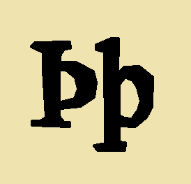
Featured image is the thorn, a retired letter from our alphabet .
Thank you to Jeff Norman for this suggestion
26. Z
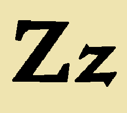
Value – 10
Aesthetics – 5
Frequency – 0.57
Z is for Zzz
There was a time when Z was not the last letter of the alphabet. No, the last letter was ampersand. There’s a kind of beauty to the last letter of the alphabet being a symbol for “and,” as if to imply that there are potential alphabetical Professors and Mary Anns stretching out to infinity. Perhaps there are secret letters out there that represent the “sk” or “tch” sounds. We have only to discover them and alter our keyboards. Alas, ampersand was removed from the alphabet at some point and Z came to represent finality, last, worst quality. Z was not always the last letter though. In the Semitic abjads, it was zayin, the seventh letter (as used in the sentence “Washington should change its football mascot to something less racist – I’m just zayin.”). It is of course self-evident that being the seventh letter is cooler than being the last.
I get why people are so into X since we’ve all been raised to think of it as a variable that equals really spooky mystery. I’d argue that Z is at least as cool, maybe cooler. Z is like a lightning bolt. It’s associated with Zorro, who can carve that letter into your shirt with his sword. All the best action words – like zap, zoinks and zowie – begin with Z. It’s certainly cooler than N, even though N is essentially a Z rotated 90 degrees. Plus, after you say it, you can proudly proclaim “Now I know my ABC’s” for all to hear. In most places where English is a dominant language, Z is called “zed,” a derivation of the Greek name for the letter, zeta. Doesn’t Zed sound like somebody you’d want to have lunch with? “Just going to Arby’s with Zed, then we’re going to go to his house and watch the World Series of Poker.” Finally, drawing a Z is fun especially if you are in middle school and the 80’s and are drawing band names like ZZ Top on your book covers. My case, it rests.
25. J

Value – 8
Aesthetics – 3
Frequency – 0.74
J is for Jack son of Jack, First of His Name
J started its life as a swash version of the letter I. I’m going to go out on a limb here and suggest that we made J a permanent letter initially not because we had an actual phonetic use for it but rather because it was just really fun to draw, especially with calligraphy pens. We had to learn calligraphy in middle school and I remember drawing Js and thinking “straight line…. straight line… Oh! Oh! Curve! Fancy!” I was bullied in middle school. Anyhow, once you realize that J is actual just a sexy I, spellings like “hallelujah” make a lot more sense. If you’re going to call out in praise to the Lord, you’re going to want to use the super fancy I. I was unaware of the whole concept of swash before I started reading about J but I see why it didn’t catch on permanently for some of the other letters. Indeed, I imagine a W with too much swash would look like a Lovecraftian nightmare.
24. Q
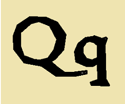
Value – 10
Aesthetics – 1
Frequency – 0.77
Q is for keyboard
I’m going to go out on a limb here and predict that Q will be the lowest ranked letter on this list once I run this through my formula. That is kind of a shame because – while I dislike how the lowercase q looks entirely unlike the capital Q – I think it is kind of an awesome letter. If you likened the letter U to a shark – picture the U rising from the water to swallow a helpless lowercase o that’s on its dream beach vacation – then you might liken Q to a remora. Depending on your point of view, these two letters either have a symbiotic relationship or maybe Q is a parasite. Either way, I love that there is a letter in the English language that is essentially useless unless it is conjoined to another letter. I’ve always assumed that Q was somehow related to O, but the evidence does not support my hypothesis. Once, the Q proudly stood on its own as the letter qoph (no U in sight) which was a consonant sound known as the velar ejective – K to me and you. Q, K and Johnny-come-lately C all represented similar sounds when the Romans stole those symbols from conquered regions and made them part of their alphabet. Eventually, the Romans got bored and just said “we’ll use ‘C’ for everything.”
So, look, we have some letters floating around in the English language that are barely used and we have some sounds we use all the time that we have to represent with multiple letters – like “ch.” All it would have taken is one Irish monk saying “it is ludicrous that I have to write two letters when I have a perfectly good Q sitting around not being used for almost anything.” Replace “ch” with Q and, for example, change “change” to qange for all time. Xmas becomes Qmas. Q*Bert remains unqanged. When Chinese (Qinese) is Romanized, we already use the Q to stand for a very similar sound. This amazing solution has been sitting in front of us for millennia. I gift it to you. Go forth and qoose to use Q for “ch.”
23. X
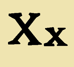
Value – 8
Aesthetics – 5
Frequency – 0.91
X is for the spot
I know there are many people rooting for X to “win” this particular list and I confess I’ve tried to juice the results a bit by using X more than I normally would in an entry. There’s only so much I can do though and because I chose “frequency of use in this entry” as one of the ranking criteria, I have the sense many people will be disappointed with X’s ultimate placement on this list. As of this writing, I don’t know where it is going to end up. Got to finish my excellent examination of the alphabet. There’s a lot to like about X. When we were launching a new program at our school and looking to name it, the kids encouraged us to include X in the name of the program because that would make it more cool. Indeed, X has grown to stand in for many unknown things in our society – the mysterious X-Ray! The uncanny X-men! When it’s December and we’re too worn out to write “Christmas” on one more card! No, I don’t know where X will end up on this list – certainly not first, but hopefully not last – but I know that it is first in many of your hearts and you can’t take that away from X.
There is a Los Angeles punk band named X co-fronted by Sandy Hook truther Exene Cervenka. I love X’s music and was planning on ranking their singles, but there are few things that disgust me more than Sandy Hook truthers. Anyhow, this means that I won’t be ranking X’s singles anytime soon. On the other hand, I will likely be ranking singles by Billy Idol and his band, Generation X. I have been slowly ranking singles by INXS with some help from my excellent friend Stu. I would be remiss if I didn’t shout out to the remarkable Chris Corner band IAMX. And then, of course, there is Terminator X from Public Enemy. My point is, I can squeeze a whole lot more X into this post by mentioning a lot of bands.
Regarding the letter X itself, it is a weird letter in that in Modern English in that it is rarely used without a vowel in front of it. If you try to say it without its accompanying vowel – like say “axe” but dump the vowels – it sounds a little like you’re trying to beat box. Kind of a “ks” sound. When it does get to be at the front of a word, it is sometimes pronounced by its name – X-Box – and sometimes is just a stand in for Z – xenomorph. Its like we have this extra letter and are trying really hard to find a decent use for it. Meanwhile, the “sh,” “th” and “ch” sounds sits off to the side waving frantically wishing somebody would give them their own letters.
22. V
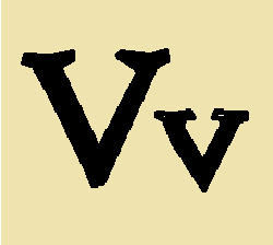
Value – 4
Aesthetics – 5
Frequency – 3.11
V for Vendetta
V – like F and Y – is descended from waw, the sixth letter of the Semitic Abjads. Both U and W are descended from V, so let’s take a moment here to acknowledge that waw has a lot to answer for in terms of letter design. For a while, F carried the sound initially associated with waw, now our W in English. The Ancient Greeks initially turned waw into upsilon (which looks like a Y) for their U sound. The Romans – too lazy to draw the bottom line in the Y – shorted it to V. For many years, V got to serve double duty as both the V sound and the U sound, somewhat depending on where it fell in a word. Never being a culture that warmed up to the idea of differentiating things clearly, the Romans also made the V the numeral 5. So if your name was Fulvia (Fvlvia? Fvluia?) and you were told that the door labeled with the symbol for five had a fine twelve course Roman meal behind it, but the door labeled with the symbol for the U sound led to where Emperor Nero was entertaining a select audience with his lyre playing, you would be in quite the dilemma. In 1386, somebody laid out a Gothic script that separated U into a vowel and V into a consonant, giving that poor overworked letter a serious break. I appreciate that the lowercase v is identical to uppercase V. Frankly, here at the end of the alphabet, it feels like the keepers of the alphabet just gave up trying to make the small letters difficult to match with their large counterparts.
21. K
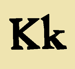
Value – 5
Aesthetics – 3
Frequency – 4.1
K is for no
Growing up, my grandmother used to call me her special K (a cereal, I note, which doesn’t currently have a mascot). I remember her telling me I’d hear the crows caw-ing to each other in the backyard and I thought they were calling me. I’m not entirely sure how my pre-K brain translated “caw” to “Kevin.” Maybe I carried some sort of crow language knowledge from a past life? I will never know. On to the letter K, which seems to have started life in Egypt as a hieroglyph for an open hand. Reading that Wikipedia entry, I note that the Phoenician K looks like it got very drunk and is currently stumbling home from a party. At one time, K, C and Q all represented different uses of the same sound, but as Latin rose, C assumed most of those sounds. Let’s face it, K and Q are a little redundant. Maybe K should have been reassigned to, for example, “Ch” or just dropped from the alphabet altogether. Much of the time, I feel like writers knew they had a seldom used letter on their hands and tried to sneak it into different words where it wasn’t really needed – words like “kneaded” and “back.” I am not going to do any additional research to prove this, but I sometimes ponder that the silent K was intended to indicated a change in a vowel sound – thus, now and know sound different even though we don’t pronounce the K. But then there’s night and knight and that just wrecks my theory – unless knight or night was a victim of the great vowel shift. By the way, linguists? You had a chance to name that event the great vowel movement and I will be eternally disappointed that you did not. If you do know the history of the silent K and wish to relate it to me in the form of a kyrielle, I would be most grateful.
20. B
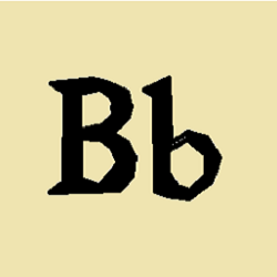
Value – 3
Aesthetics – 4
Frequency – 4.93
B is for B
At one point in history, some letters had names that were longer than one character long. Take B for example. The B we use in English is descended from the proto-Germanic rune berkanan, which means birch. It was beorc in Old English and bjarkan in Old Norse. You needed to use this letter to spell any of the words which described this letter. Runes, for you linguistic beginners, seem to be letters that The Man wants to keep down by implying they are primitive even though they were used for creating pillaging lists and writing dirty jokes just like The Man’s (so-called) letters. I particularly hate “B” because noxious people have adopted its Greek form – beta – to mean “emasculated.” Yeah, Gilligan, put your minnow in a tank with a betta and see how that works out. That’s called a homonym, like B and bee. You need a “b” to spell “bee” but a “b” is not a “bee.” How do we even communicate anything? Also, lowercase b looks like a B that has had an accident.
19. P
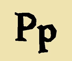
Value – 3
Aesthetics – 4
Frequency – 4.99
P is for huh huh… huh huh… you said… huh huh… huh huh huh
The Ancient Greek letter pi was a step in the evolution of P. Now, P is the first letter of pi. I feel like I should take a minute here to ponder the Ancient Greek alphabet. At one point, it was an alphabet used to make shopping lists and write erotic messages about ya girl Timiona. Like all alphabets – eventually, even our alphabet – the Ancient Greek alphabet evolved in all sorts of different directions, including into Modern Greek. Mathematicians and Scientists working in cultures where Ancient Greek was no longer an actively used text decided to use Greek letters to represent different constants, variables and functions (I assume functions). I imagine studying math in Greece is a special kind of annoying. Imagine if during your days studying geometry pi actually was represented by the letter P. That is the experience of every Greek high school student today. Wait – Greece is in Europe, not the United States. That is the experience of every Greek middle school student today. Since Greece was much admired as the cradle of democracy and Western culture, college fraternities and sororities adopted Greek letters and celebrate that ancient culture through ritual spanking and blackout drinking. And, of course, drinking to excess brings us back to P.
I’m not proud.
18. G
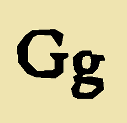
Value – 2
Aesthetics – 1
Frequency – 6.37
G is for Kagaku Ninja Tai Gatchaman
If you’ve already read the entry for C by this time (and since I haven’t ranked anything yet, who can say if you’ve read that or not), you will know that C and G shared a common ancestor. As such, the Wikipedia entry for G covers some very interesting ground about how G may have replaced Z/Zeta because a Roman censor in the third century named Appius Claudius found Z distasteful because it was foreign. Joke’s on you Appius Claudius! Everything about the Roman Empire was foreign! Even your gods were borrowed from the Greeks! It would be like people in the United States objecting to foreign things when almost the entire population and culture is foreign! Ha ha ha!
Oh wait.
Anyhow, wealthy bigot Appius Claudius just struck Z from the Latin alphabet but G was possibly introduced by a freed slave named Spurius Carvilius Ruga who thought it was ludicrous that C was used for two different sounds, both of which were in his name. This makes Ruga the actual original G. I wish we lived in a time where we could just invent new letters to address the “multiple sounds to one letter” issue. In my name, for example, the O in Robert and the O in Doyle have different sounds and I would like to suggest that the O in Doyle be replaced with this symbol of my own invention. It’s a little complex but I hold out hope that some Cretan will simplify it someday.
The uppercase G and lowercase g don’t even face in the same direction, dog.
17. F
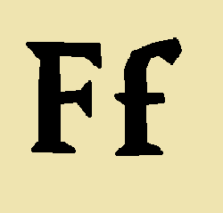
Value – 4
Aesthetics – 4
Frequency – 6.81
F is for barely repressed rage
Researching the history of letters has been eye opening for me. Before this project, I never would have known that F probably started out as a lollipop but then somebody bit the top off the lollipop (actual footage of the birth of the letter F) and it was named waw or maybe vav.
(As a side note of interest to nobody but myself, I was tested for the Gifted and Talented program in Newtown Middle School. The way they tested us was they gave us a piece of paper with a symbol on it and asked us to turn it into something else by drawing lines around it. I think I turned a yield symbol into something interesting because they let me into the program. At the time, I wondered how my ability to look at a bunch of lines and imagine something else would ever be of any use to me in life. Now, on my free blog, I’m writing 26 entries for letters where I more or less imagine those letters as different things. I leave it to the reader to gauge whether this qualifies as “any use” or not)
Anyhow, I am amazed at how much some of the sounds associated with these letters has changed over the years. “Waw,” for example, generally sounded like a “w.” This was the sound associated with F’s ancestors until Latin came around. The Romans used V for both U and W (and 5) and I guess decided they wanted to keep the F but assign it to a new sound. Imagine a poor Etruscan coming to Rome and they have their little “Fodor’s Guide To The Roman Empire” and they keep asking for directions to the “Worum Romanum.” Oh, many a cruel laugh was had at the Etruscans’ expense I bet!
16. W
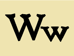
Value – 4
Aesthetics – 5
Frequency – 7.25
W is for Wendy… Wanda… Wendy
A Fish Called Wanda has led me to believe that at least some middle and upper class humans in the UK called W “wuh.” I can’t find an adequate link, but John Cleese’s character, Archie, has a necklace with a W on it for his would-be lover, Wanda, that he somehow gives to his wife, Wendy, who say “Oh, it has wuh for Wendy.” Something like that. This makes so much more sense than calling this obvious double V a “double U.” F, you may already know (or you might be soon to learn, depending on how these letters ultimately get ranked), was the letter that was associated with the W sound in ancient times, so had that remained unchanged, that line in the (now renamed) A Fish Called Fanda would have been “oh, it has an F for Fendy.” Like many letters, W was descended from waw, but it’s the Germans who are to ultimately blame for shoving two V and or U together. For many centuries, a rune called wynn stood for the W sound in Germanic, but at some point somebody decided they liked writing “uu” and/or “vv” better. The wynn looks a little like a badly emaciated P, so while I’m dubious of using two letters to represent one sound, since this ultimately resolved itself into a single (albeit poorly named) letter, I support the deep thought that went into this cultural decision.
15. Y
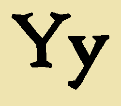
Value – 4
Aesthetics – 4
Frequency – 7.42
Y is for the less cool chromosome
When I look at a Y, I turn into an 11 year old and see the top of somebody’s butt.
14. M
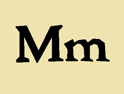
Value – 3
Aesthetics – 3
Frequency – 7.71
M is for “Once there was this boy whose/parents made him come directly home right after school”
M looks like somebody started to draw an N and didn’t want to stop. “This N is so perfect, it needs ONE MORE LINE.” That, however, is sadly not the case (THAT WE KNOW OF). In fact, M is theorized to be somehow descended from the Egyptian hieroglyph for water. I can see how the waves in water might look like an M or, oh I don’t know, a W (the history of W is much more weird). Allow me to present an alternate theory about where the M came from. There are certain tabby cats that are referred to as mackerel tabby – like our model, Dr. Mister Levi Kawalski. These tabby have what looks like an M on their head. Also, they say “meow.” M. Meow. I rest my case and now stand open for cross examination and for points of clarification. Alas, the ancient Greek alphabet refutes my perfect feline theory of phonetics because their version of M is named mu – decidedly not the sound a cat makes. I encourage you to go to look at the lowercase version of mu because it looks like the saddest lowercase u you’ve ever seen. I want to give it a hug and make it some tea. The lowercase m in the English alphabet looks like a little baby M that hasn’t quite learned how to stand up straight yet. Stretch, little m! Stretch!
13. C
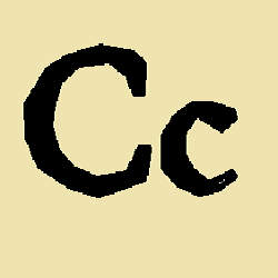
Value – 3
Aesthetics – 5
Frequency – 8.52
C is for… sing it with me
C and G come from the same Phoenician letter – presumably some Phoenician convulsed while writing a C, saw what they created and decided “let’s keep that.” I joke because the original letter was named gimel – friend to Legolas and valued member of the fellowship. I joke again. Gimel was the third letter of the Semitic abjads – writing systems with symbols or glyphs instead of letters. A glyph or a symbol is a way linguists describe things that do exactly what letters do but do them in a way that sounds more appropriate for a – yes – Tolkien novel. I like the word abjad because it adds more J to this list increasing its value for the final ranking. C looks like an O that has been bitten in half by a blue furry monster. In music, a “high C” is the defining note of a Soprano as well as a refreshing fruit drink. All of these entries make both more and less sense if you read them out loud.
I appreciate how lowercase c looks like the Mini-Me of uppercase C.
12. U
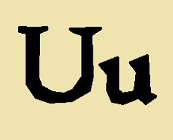
Value – 1
Aesthetics – 5
Frequency – 9.78
U is for Prince
The French Academy didn’t formally accept U into the alphabet until 1762. I have questions. Why does the French Academy get to decide this? U had been in use for years, so why 1762? Was there a radical group of French academics – flamboyant young upstarts – who fought to get the letter added? How did they spell “vous” and “tu” before you? Especially how did they spell “vous” since both “v” and “u” were frequently interchanged? Did they spell it “vovs?” Doesn’t that seem, like, really especially un-French – or vn-French, I gvess? There are all probably things I could Google, but I’m going to enjoy my ignorance just a little longer. Most of what is interesting about U is also interesting about V, which you likely have already read.
It should be noted that while there is no “I” in “team,” there is also no “u” in team. Make of that what you will.
11. D
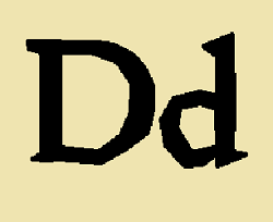
Value – 2
Aesthetics – 4
Frequency – 11.77
D is for… No. Stop. Not that.
Here is where I tell you about the ISO basic Latin alphabet. ISO is the International Organization for Standardization – a group which promotes industry wide standardization. Its official languages are English, French and Russian. ISO is not an acronym (because if it were an English acronym it would be IOS, if it were a French acronym it would be OIN and if it were a Russian acronym it would be beyond the scope of this alphabet project) but rather an ALLCAPS abbreviation of the Greek word isos – which means equal. You’ll note that ISO does not equal isos. This is how international standardization works.
The ISO basic Latin alphabet consists of 26 Uppercase and 26 Lowercase letters from A-Z – the alphabet we are working with here. Contrast this with the modern English language alphabet, which consists of 26 Uppercase and 26 Lowercase letters from A-Z – the alphabet we are working with here. You can have two identical alphabets with two different names. Take a few minutes the next time you’re in a bar to identify a linguist and buy them a drink. Hey! Drink starts with D!
D seems to have started its life as the Egyptian hieroglyph for either fish or door and then evolved into the Phoenician dalet (which may sounds like a Dr. Who villain, but it isn’t because you can shout “exterminate” without needing a dalet, but you can’t spell “Dr. Who” without one). D is one of the more useful letters for emoji construction, seeing as it can be used both for the laughing face (:D) and the face of ultimate despair (D:) – the whole emotional gamut from D to D.
10. L
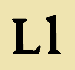
Value – 1
Aesthetics – 1
Frequency – 15.16
L is for looking kind of dumb with a finger and a thumb on her forehead
L is related to a variety of similar semitic abjad letters like the Phoenician lamedh. It is closely related to the Arabic lām. If you compare the latin L and the Arabic lām, you’ll note that the L breaks to the right while lām breaks to the left. This means when you perform “All Star” in a country that employs Modern Standard Arabic, you need to use your left hand to make the “loser” sign. I am left/right dyslexic and one trick they tell us about in dyslexic school (which, in my day, meant meeting another dyslexic and swapping tips) is that you can tell your left hand from your right by making L with both hands and pointing your thumbs together. The hand that looks most like an L is the left one. To me, they both look an L. I learned I was dyslexic and not merely kind of dumb when I tried to study Mandarin Chinese. In my brain, hanzi all turn into little dancing cartoons. Also, over three years in Chinese language study, I had three different professors who used three different forms of Romanization. I knew less Chinese when I finished my third year than I knew at the end of my first year. I’ll say this though – in terms of grammar and syntax, Chinese makes so much more sense than English. In terms of spoken tones and written characters, it felt like little pieces of my self-esteem were dying every single day.
Wait, L. Yes. Ok, let’s talk about L. In Roman numerals, L is 50. But, you know, its lowercase forms looks like I, which is 1 in Roman numerals. 51 is, thus, LI, which kind of looks like a square U if you’re not wearing your glasses, but also like an uppercase and lowercase L hanging out together. This is where I praise the value of fonts with serif. On this site, I’ve chosen a sans serif font and I’ve never regretted that more than when I ponder the L.
9. H
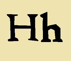
Value – 4
Aesthetics – 2
Frequency – 16.38
H is for M-I-S-E-R-Y (if you add an “e”)
Note to self to delete later – don’t make the “ignore the hetas” joke. If you dive into the dad joke well too many times there’s no coming back.
The letter H probably descended from a hieroglyph for fence. I see that – it looks like an especially tiny, ineffective fence. You know, it also looks like a high school football field goal post. You could probably play the world’s most pointless game of tic tac toe using a letter H. Two moves. No winners. In some ways, that is a kind of metaphor for life. In some ways. H is a very friendly letter. It really digs hanging out with T, C and S especially. English is weird – “Th,” “Sh,” and “Ch” all are sounds that could use their own letters. Indeed, “Th” once was represented by thorn, which came to look like the elongated “y” of “Ye Olde Arby’s.” Thorn stopped being used because in the Gothic typeface, it looked too much like Y. There couldn’t have been more than like 25 printing press and they decided they’d rather eliminate a letter from the language than select a different font. We could have had 27 letters but instead a few printers decided to make H do all the heavy lifting. I know, I know. Don’t be a heta.
8. R
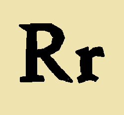
Value – 1
Aesthetics – 2
Frequency – 17.70
R is for soul killing pirate jokes
As those of you who know me probably can guess, I am keenly interested in this letter. People ask me all the time “what does the R in R. Kevin stand for.” I usually answer “Justice.”
But let’s go to some history for the real story. Back in the early 80’s, computers weren’t really a thing yet. Like if you went into a school’s main office, the student files were all kept in file cabinets. I recall these weird file cabinets with drawers somewhere between the size of a card catalog and a regular file cabinet. When a new school year began, the office staff had to prepare every class roster manually. Imagine that and cry a tear for pre-computer school administrative assistants. Anyhow, the files in these drawers were what you’d call your permanent record (“Oh yeah? Well don’t be so distressed”). The office staff took these records deadly seriously and they didn’t care if you were, say, born with the first name Robert but called Kevin all your life. Thus it was every year I was in high school (and middle school), on the first day of each class, when it came time to call my name, two things would happen.
First, I would have to correct the teacher and ask them to call me Kevin instead of Robert. Most would be cool with this, but some just refused. Thus, my name in my French class for five years was the French version of Robert – Robert. But pronounced differently. My French teachers in grades 9, 10 and 11 each retired from teaching due to extreme old age so I took Latin in grade 12, where my name was (I think) Kevin. I just want to say how jealous I am of every William who became Guillaume.
Second, my teacher would ask me if I was any relation to Robert O’Boyle. O’Boyle was a perfectly decent chap in the same grade as me and I wonder if Newtown school teachers asked him if he was related to me. I never asked. What irks me to this day is that O’Boyle and Doyle are not the same name any more than Smith and Smyth are the same name. The giveaway is that they’re not spelled the same. My teachers asked me from grade 6 through grade 12 if I was related to this other dude because we shared a first name and our names rhymed.
Anyhow, if school administrative assistants were entirely unwilling to alter your name because it’s a permanent record, just imagine how unwilling bank tellers would be to… what? Oh, I can drop the Robert and replace it with an “R” on my checks so that Sears employees know I’m the same guy when I show my I.D. that says Robert? Sure, sign me up for that.” So I became R. Kevin on my checks.
When I did my first play in college, I knew my grandfather was coming to see it. I didn’t especially want anybody calling me Robert, but I’m named after my grandfather and I didn’t want him to think I was outright rejecting the name. I recalled that I was “R. Kevin” on my checks and listed myself as “R. Kevin Doyle” in the program for the ’86 production of Terrence McNalley’s Bad Habits. The name kind of stuck as a nickname. When I came out to Hawaii, I figured I’d throw the R away and just go back to being called Kevin. On my first day of grad school in my first class as all the new grad students are introducing themselves, the guy sitting next to me turned out to be named Kevin too, so I kept the R just for ease. At UH, many people (notably my late mentor, Terence Knapp) thought the “R’ might mean “our,” which made me “our Kevin,” a thing I rather liked.
Then R Kelly SPOILED EVERYTHING. The End.
The letter R seems to have started life as the Egyptian hieroglyph for hipster and then spent some time as a P that had sprouted a terrifying Lovecraftian tentacle. Now that little extra line off of the P looks like a stick somebody put there to keep it from falling over. The lowercase r doesn’t really look like it might be the same letter at all – at best, it looks like somebody started to draw a tiny R and then just gave up.
8. S
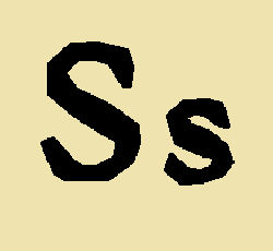
Value – 1
Aesthetics – 5
Frequency – 20.29
S is for scaring the cats off your computer when they’re misbehaving. Tch works too.
One would think that S might have started as a snake hieroglyph, but one would be incorrect. The snake turned into an N (but was pronounced like a J – you might already know this depending on where N ranks on this list vis-a-vis S). The actual history of the S (including its extinct lower case form – the long s) is pretty fascinating as far as these things go and I encourage you to just follow that link to Wikipedia and read about it. Lowercase s looks just like Uppercase S – something I find aesthetically pleasing. In fact, in the back half of the alphabet, there are more cases where the uppercase and lowercase letters are identical. If I’m going to be a stickler, there’s one letter from A to M with identical cases (C) compared to seven letters from N through Z (O, P, S, V, W, X, Z). Yes, sure, this depends on your font, but we’re talking the ISO Basic Latin Alphabet here.
6. N
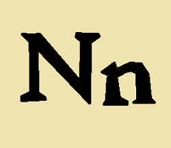
Value – 1
Aesthetics – 2
Frequency – 21.69
N is for Zero
The Egyptians had a J sound in their language that they represented with a snake. And, what do you know, a J looks a little like a snake, so naturally, the Egyptian snake became the letter N. However, the Phoenician ancestor of N, nun, means fish in Arabic. Linguists spend all day putting this stuff together. I imagine them sitting in a room lit with fluorescent lights. On the wall, little post its of runes, letters, glyphs and squiggles, all connected to each other via tacks and yarn. “A snake is kind of like a fish,” they think. A new piece of yarn is produced. Hand shaking, they tack that yarn from snek to nun. “If I get this to Wikipedia first, I win the edit war.” Later, Ken Burns makes a documentary about the many linguists who fought to turn a bendy animal into a couple of very straight lines. Having spent years in academia, I am certain both that linguists have better evidence than that to make this connection and also that this is the sort of theory that could completely collapse like a house of cards if we stop believing in it. So clap your hands and say “I do believe in linguists” and you’ll keep the memory of that mummified snake alive each time you write “Nefertiti.”
5. O
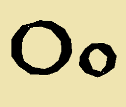
Value – 1
Aesthetics – 5
Frequency – 23.21
O is for realization
Is there a more perfect shape than a circle? Yes. Circles are pretty cool though and their somewhat more fit cousins, ovals, also are reasonably excellent. The big O and the little o are aesthetically perfect and there’s no doubt that they are the same letter. It is a very popular letter too – I read online all the time about people expressing great fondness – even longing – for the big O. As it happens, the old Phoenician word for the O was ayin from the proto-semitic “ayn-“which means “eye.” Fortunately, I am mature enough to recognize that the ancient pronunciation of O was not the same as the modern pronunciation of “eye” because otherwise I would descend into madness pondering that O was I. O is apparently the fourth most frequently used letter in modern English – a thing that I would not have predicted. I would sooner have guessed S or H and I would have been wrong. Now, that frequency chart is based on how many times each letter appears in a word in the dictionary, not in a specific piece of writing. For example, I imagine that in any given issue of X-Men, the letter X completely breaks that curve. I’ve moved from O to X. The circle is complete.
4. I
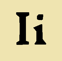
Value – 1
Aesthetics – 3
Frequency – 23.23
I is for lookalike
You are designing the world’s first ISO basic Latin Alphabet alphabet. What better and easier shape to use for a symbol than a straight line? You decide you want the line to be vertical (maybe you’ll use the horizontal line for the “sh” sound when the time comes, if you remember). You draw your line and it is so pretty. You love it so much you think “I want this shape to stand for me, myself and… Oh! I!” So I becomes I. But you already promised your friend Colin that A would be the first letter. Damn! You wanted to be first. First? FIRST! Eureka! Your new letter can also be the symbol for the number 1. That will show Colin. I is also 1. And lowercase L because it’s your alphabet and if you want every single letter can be an I. The concept of “user friendly” doesn’t exist yet so your new alphabet can look the like the way that Woodstock from Peanuts chirps. “No ‘I’ in team?” you think, “In my alphabet, there will be four ‘I’ in team.” You laugh just a little too loud and everyone in the library looks at you, but you don’t care one iota. Also, you’re a huge fan of Lord of the Rings so why not make the lowercase i look like the Eye (get it?) of Sauron sitting on its dark tower. But the Eye isn’t Sauron. It is you, you monster. And even “you” is spelled I.
3. A
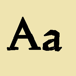
Value – 1
Aesthetics – 2
Frequency – 25.62
A is for Overrated
Why am I even… What made me think… Ugh…
So you know I’m writing these reviews of letters – letters – LETTERS – in alphabetical order and because of my ranking system – which I’m immediately realizing creates a whole additional layer of work for myself (note – find website that counts individual letters in a text and plan to run that 26 times) – I’m writing about A first anyways. Also, as I write this, I have no way of knowing where it will end up on my final ranking. Also, also, if – after I’m finished writing this – I want to edit or add anything about (quite literally) anything, I have to recalculate and edit my entire list, which involves cutting and pasting individual entries and badly drawn MS Paint letters all around. So, no, I won’t be fixing anything in this entry ever.
Also, it just now dawns on me that you won’t be reading this first. I mean, seriously. What the what?
According to Wikipedia, A started out as an Egyptian hieroglyph shaped like an ox. The Cretans – being cretins – couldn’t quite draw an ox and made what was essentially the ancient world version of an MS Paint version of an ox – and I would know. However, it wasn’t really A until the Phoenicians (who presumably invented Hooked on Phoenics) turned it into aleph, which looks a little like a hastily scrawled anarchist symbol and sounded like, well, a glottal stop. So basically, linguists agree that the first use of A neither looked much like nor sounded like A. One thing I hope we can all agree on is that it doesn’t deserve to be the first letter on THIS list because not only isn’t it the best letter, it isn’t even the best vowel. When I was a little kid, I disliked A because lowercase a didn’t especially resemble uppercase A. Now, I just think that’s poor design.
2. T
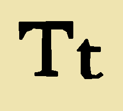
Value – 1
Aesthetics – 3
Frequency – 31.27
T is for Two
In the Hebrew and Semitic alphabets, T was the final letter. The sound associated with this letter has been virtually unchanged since those times. At one point, it looked like an X until the Greeks straightened it out like a sloppy necktie. The Greeks called this letter tau. T is the most used consonant and the second most frequently used letter in the English language (note – you can spell “English Language” without using a T). The process of turning a spoken language into a written language seems overwhelmingly baffling to me. There was a time where there was no written language and then somebody invented one. This person – let’s call them Ninsun – decided one day that it might be useful to label her food in the, uh, well, not refrigerator… food hole I guess? Anyhow, Ninsun didn’t want anyone to eat her beans, so she invented language and painstakingly carved “don’t eat these beans, Lugalbanda. If you touch them I will cut you with my shuhadaku.” Alas, the new language wasn’t intuitive to Lugalbanda and he ate the beans and got cut and due to the poor quality of the health care system in Sumeria, he eventually died. However, language was born because everyone else in the village thought “oh damn, we’d better learn to… uh… understand Ninsun’s squiggles or we’re going to get cut too.” Ninsun explained that the word for understanding squiggles was now “read” and they were all too frightened to disagree with her. She was the first language arts teacher and a total badass. Anyhow, Ninsun got to T and said “that’s all the sounds we’ll ever need to represent with written letters” and Lugalbanda (who was still slowly dying at this point – I mean, it was really awful and for what? Some day old beans) said “what about the sounds ‘ch,’ ‘sh’ and ‘th?’ Shouldn’t they get letters too?” They all shook their head sadly because this was ancient Sumeria and those sounds probably weren’t going to be important yet for a thousand years. The first language arts student.
In future alphabets, people added letters after T, several of which are nearly useful.
1. E
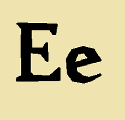
Value – 1
Aesthetics – 2
Frequency – 40.64
E is for X-Men, XTC and X-Ray
I can’t be certain of this, but at the Wikipedia entry for the letter E, it appears that the letter was descended from the Egyptian hieroglyph for “abject surrender.” Look and judge for yourself. It is the most commonly used letter in English, which makes it a pretty good contender for the #1 spot on this list (unless the Scrabble values work as expected and give X, Z, J and Q an unfair boost). This is a great place to discuss the novel Gadsby by Ernest Vincent Wright. Gadsby was a 50,000 word lipogram – a piece of text deliberately written to exclude a specific letter, in this case “e.” Mr. Wright did include both his first and middle name on the cover of the book, which increased the E count by three. Written in 1939 without the aid of a program to search for any errant E, three managed to slip in (and you, 80 years later, are fortunate to be able to search for all those “e” at Project Guttenberg). If you decide you wish to comment on this entry – either here or at Facebook – I challenge you to do so without using the letter E even once.
And that does it for this ranking of letters of the alphabet. I look forward to seeing what order they end up in after I count the letters. Many thanks to expert editor Rebecca Stanton for offering to give this a once-over before I count so that I don’t have to make edits and rearrange the list later.
Coming Soon: I can’t believe I’m writing this but… Deities of the Cthulhu Mythos

Once-over, forsooth. I’ve actually given this text a thrice-over at minimum, trying to decide which entry delights me the most, and while R holds a special place in my heart for a variety of obvious reasons, I have inexorably come to the conclusion that they’re ALL my favorite. Each and every “[Letter] is for….” fills me with inexpressible joy.
I left this wishing there were more letters or that we used the existing ones better.