

This is my division! My beloved Red Sox! The despised Yankees! The industrious Orioles! The Canadian Blue Jays! The Rays who are not devils anymore! I follow the adventures of these teams everyday and wouldn’t lose a one of them to any other division. I might dislike the Yankees, but I love the Red Sox/Yankees rivalry. I’ve always had soft spots in my heart for the Orioles and the Blue Jays (because they help the Red Sox by beating the Yankees) and I acknowledge that the Rays exist (they’re having a better season than the Red Sox right now, but should they slip into third place as the Red Sox climb to second, I will think more fondly of them).
“But Doyle,” you say, “You love the Red Sox and have for decades. How can you possible judge their hat or the Yankees hat fairly?”
I can’t, but I also can. I mean, I’m intellectually incapable of giving the Yankees a win even in this arena, but their hat is undeniably an all-time classic (see below – spoiler: they’re not ranked last).
Also, this section of my hat rankings is dedicated to the late Bill Buckner, an all-time Red Sox great.
5. Tampa Bay Rays
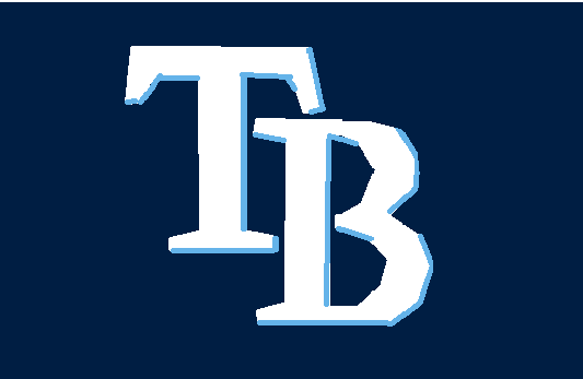
I acknowledge that “TB” stands for Tampa Bay but surely I’m not the only one who sees those initials and thinks “Tuberculosis.” I feel like I can rest my case here, but I have more issues. For example, the light blue “shading” to give the monogram a slight 3D effect – specifically an effect that suggests you’re below (and slightly to the right) looking up at the letters. This is great for a band logo (The Van Halen “VH,” the Weezer’s deliberate “W” parody of that logo, etc) but it’s a little too slick for a baseball team logo. I’d even suggest that this is another corporate designed branding monogram, but it is slightly more subtle than the others so props for that. Also, the two letters arranged in this manner feels at least a little baseballish. While it’s not nearly as cool as the Diamondbacks snake, the Rays also have this alternate logo of a devil ray that (with a different color scheme) would be an excellent hat logo – especially in the mascot-heavy AL East.
4. Baltimore Orioles
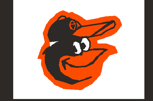
To the Orioles’ credit, they’ve been using this silly cartoon oriole more or less since it was introduced in 1966. While they’ve also occasionally used a more realistic oriole design, a fifty year commitment to a logo that shows its age is a very baseballish thing to do. You’ll note that the cartoon Oriole wears a different cap – an O with a kiss curl. For a time this century, the players wore that design. There’s kind of a meta-thing going on there that is now compounded when the players wear the cartoon logo cap – like, before the Orioles traded Manny Machado to the Dodgers, Machado was an Oriole wearing a hat with an oriole wearing a hat with an “O,” for Oriole. If he’d ever thought about that fact he probably wouldn’t have been able to function well enough to be an All-Star because I’m thinking about it now and I can barely type. The black and orange works for me both because they’re strong contrasting colors and because those are realistic oriole colors. Indeed, if I can paraphrase a statement that has haunted Orioles fans for years, it’s a great logo, but it would finish higher in a different division.
3. Toronto Blue Jays
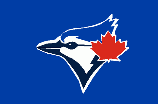
I’m giving Toronto a slight edge in the AL East “Battle of the Birds.” This is the same classic Logo that the Blue Jays used when they debuted in 1977. They did lapse into a kind of unfortunate bird-headed-T logo for a few years, but more sensible people (Toronto, despite the election of the likes of Rob Ford, is filled with sensible people) brought back in 2008 and it’s only been improved since (they removed the baseball background and fixed the bird’s mouth). The blue jay in the logo has found a very tiny maple leaf that it enjoys wearing behind its left ear. Or maybe it’s wearing little maple leaf shaped ear muffs or headphones and we’re only seeing one side. Either way, this little dude is patriotic and, like Baltimore’s oriole, properly colored. I own a Blue Jays cap (one of the ones with the creepy Bird-headed-T) and I enjoy wearing it quite a bit, especially outside of the US. It proclaims “I am a fan of baseball, but you can assume that if I voted for somebody questionable, it was probably Rob Ford, who was a screw-up, but who never controlled the world’s largest military.” Then, after I’ve tricked the local citizenry into thinking I’m Canadian, I can admit I’m from Hawai’i and continue to be regarded with trust instead of anxious concern. As with the Orioles, this would be a contender for #1 or #2 in a different division.
2. New York Yankees
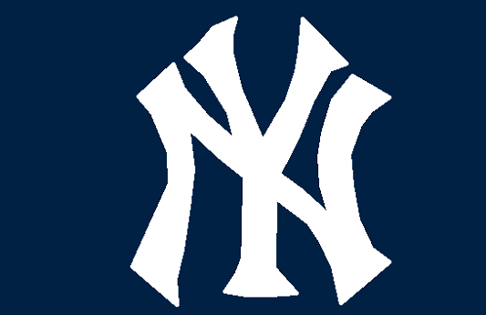
The Yankees have been using one version or other of this classic logo since they adopted that name in 1913. Indeed, it’s remarkable how little the logo has changed. In point of fact, back before the New York Highlanders became the Yankees, this was their logo as of 1910. So it exceeds the parameters of my “baseballishness” test. Indeed, it (along with a few other older logos) defines the parameters. It is one of the most instantly recognizable sports logos in the United States and, love or hate them (I’ve made my position clear), the logo is an absolute triumph in simplicity and form. I appreciate that it is only two colors and that the serif are just this side of sans. Yes, sometimes if I squint, it looks like it might be a six armed horror from a Ray Harryhausen film, but that just makes it seem like an even more formidable enemy. If you ever see me wearing a Yankees hat, it means I’ve either lost a bet or am signalling distress (likely both) but I have nothing but praise for the monogram.
1. Boston Red Sox
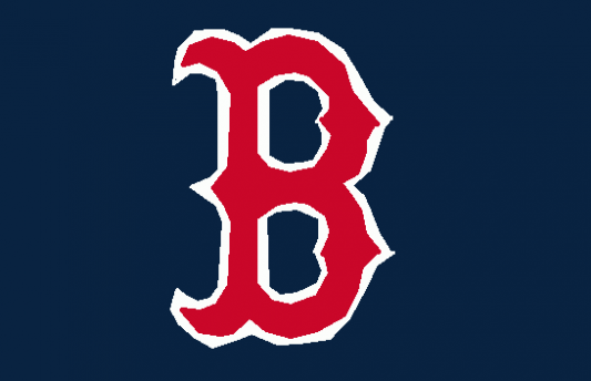
I mean, this is entirely predictable, but I think I can justify it on several fronts. First, while this isn’t as old as the Yankees logo, Boston has been using this same basic design since 1936 and the same logo colors since 1946. The old fashioned many-serif-ed B feels like an old timey baseball logo because that is exactly what it is. Boston (as the Boston Americans – the featured logo on this entry is a Boston Americans logo) was an inaugural member of the American League (along with the proto-Yankees) and thus it makes sense that the logo is red, white and blue. I argue that it doesn’t scream “FLAG, MOTHER FATHER” because the blue overwhelms the red which in turn overwhelms the white, but your mileage may vary. Also, you can print out the Red Sox “B,” cut off all the blue parts, and have a fine devil-horned domino mask for your next masquerade ball. Finally, they’re my favorite team and seeing the “B” out in the wild always makes me happy. Come on, people, these lists are about my feelings, not statements of objective fact.
But I stand by my belief that this logo is objectively the best.
Spoiler: this will be #1 on the overall list, too.
Coming Soon – American League Central
MLB Hats Ranked – NL East – NL Central – NL West – AL East – AL Central – AL West – MLB 30
They just recently went back to the Cartoon Oriole.