
All but one of the logos in the American League West were a total pain in the butt to draw. Perhaps not coincidentally, I’m ranking them in descending order of how much pain they caused me.
I was a fan of the California Angels for most of the my elementary school career, especially when Nolan Ryan played for them (my loyalty did not shift to the Astros when he was traded there – in fact, it shifted to the Mets around fifth grade as I sought a more local team I could cheer for). None the less, when they finally won a World Series in 2002, I was quietly elated.
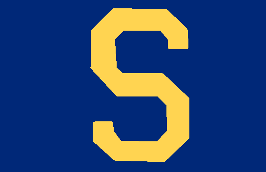
5. Seattle Mariners
Seriously, trying to recreate this logo on MS Paint filled me with a white hot fury. When they joined the league in 1977, they had a perfectly fine stupid, simple cap logo – a trident (like Aquaman might carry?) ending in an “M.” Over the years, they’ve gradually incorporated the “baseball compass” part of their overall team logo onto the hat. Look, let’s be frank. If your baseball needs a compass, you have some much bigger problems than an overly complicated logo design. This logos’ colors are blue, yellow and cream, but they managed to pick the most flat version of each of these colors – perhaps to suggest something some salty old seadog painted on his schooner? I don’t know. What I do know is it took me 45 minutes to draw this sucker and that makes me berserk.
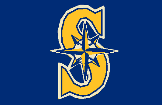
And do you know what the most infuriating thing about this logo is? IT’S THE WRONG LOGO. This is the correct logo and it is considerably cooler (if no easier to draw and no I’m not going to draw it again). My regular logo site listed this one as the most recent, but it’s only “special occasion” recent. I assure you I’d have still ranked the “classic” Mariner’s logo at the bottom because it is too complicated (fails the “second grader drawing it on the blackboard” test) and it feels a little too corporate designed to satisfy my “baseballishness” test.
I love the city of Seattle and have a hat with the correct logo on it, so basically I’m an idiot.
4. Houston Astros
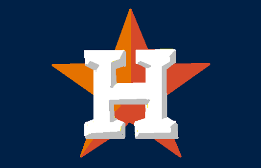
With the caveat that I’m pretty happy with how this turned out (and I’m thrilled to report that it is the correct logo), this could just as easily be a logo for the History Channel – maybe for “One Star General” week or “Celebrating Texaco Oil” week or something. While this current logo is the same essential design as the one they used when they debuted in 1965, I dislike the “3-D effect” both because it’s hard to draw and because that’s one of the elements that seems “corporate” to me on this and other logos. Furthermore, I have to admit, I’m partial to the more modern-looking “abstract lone star” logo design they used from the mid-90’s through 2012. That is a simple and effective design that may not be especially baseballish, but passes the less important (but still vital) “is it cool” test. Yes, it is cool. One thumb up and a loud “ayyyy.”
3. Los Angeles Angels
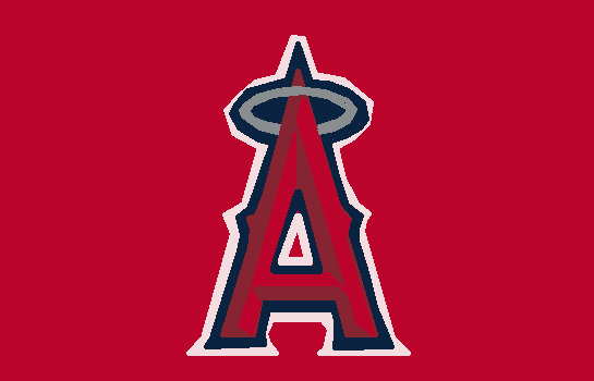
Here’s an “Ayy” right now! Let’s all remember that Fonzie jumped the shark while the gang was visiting California from Milwaukee. This has kind of been the basic Angels design on and off since 1972, though they had a few doozies both before (a “C” groping an “A”) and after (I would have given up on this whole project immediately if I’d had to draw that in addition to Seattle) they introduced this one. I don’t object to the concept, but again that shading. The AL West has gone shading crazy. I do appreciate that they added some of those little spikey things to the side of the A, which seems very baseballish to me.
The AL West could potentially have three teams with an “A” logo – the Astros, the Angels and the A’s. While it would make more sense for the Angels to use LA to distinguish themselves from their division mates in Oakland, it wold have created some confusion vis a vis the Dodgers. Oakland certainly can’t expect to have an “O” on the cap since it looks like a “zero” (on the hat that the oriole on the Oriloes’ hat wears, the “O” has a curly-cue to avoid this problem), so making their “A” the angelic A was a good design choice. Furthermore, it suggests that their A is divine while the Oakland one is damned. That’s the kind of shade I like, L.A.
2. Texas Rangers
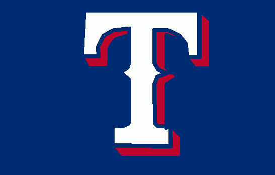
Texas had an ugly, blocky “T” that looked like it was maybe supposed to conjure up images of longhorn steer in its early days. In 1994, they add “baseballish” spikes to the “T” (score) and also added the shade (foul) which seems to be de rigueur in this division. Texas, you’ll note, was reluctant about the shade because they don’t let it touch their “T.” Or maybe they figured the further they moved the 3-D effect away, the bigger the logo would look. Who can say? This “T” is equally comfortable on a baseball hat or next to the word “BONE” on a steak house sign. I don’t know, but I like it because it both summons up a little bit of classic baseball but also feels distinctly Texas. Good for them.
You know what else I like about the Rangers? Governor Bush (later President) sold his stake in the team when he was running for president so he wouldn’t have a conflict of interest should he be elected president. That’s what you do when you are serious about being president – you get rid of your business conflicts of interest. By selling them. So there’s no chance anyone thinks they can, you know, bribe you by using your business. I mean, Jimmy Carter had to sell his peanut farm, George W Bush had to sell the Rangers. Oh, the halcyon days of everything before 2016!
1. Oakland Athletics
What is Fonzie’s favorite baseball team!
The Milwaukee Brewers of course. Fonz is from Milwaukee. In my fantasy world of a Happy Days series that just continued and continued, when the Brewers returns to Milwaukee (technically, when the Seattle Pilots move to Milwaukee and were renamed the Brewers, since the original Brewers moved to St. Louis then Baltimore, eventually became the Orioles). Fonz and the gang are big early fans of the team. This being TV, Fonz ends up working for the Brewers and, over time, becomes a part-owner, then a local politician and finally ends up betraying his youthful values by become part of the establishment by the late 80’s. He realizes this has happened when he hits a jukebox and it doesn’t play. Spiraling into a mid-life crisis, he sells his share in the team, resigns from office, buys a classic motorcycle and starts hanging around at Arnold’s (now a Howard Johnson’s). He develops a reputation as a guy who can fix any classic engine and opens his own garage again. He’s not a big and powerful guy in the community anymore, but he’s doing what he loves and has the respect of his family and friends. Most importantly, he’s restored his self-respect. Juke boxes start for him again. He has a late-life marriage to Pinky Tuscadero (who, it turns out, is a brilliant mechanic too) and they have a blast for the rest of their lives fixing and customizing Triumph Trophy TR5 Scramblers and attending Brewers games.
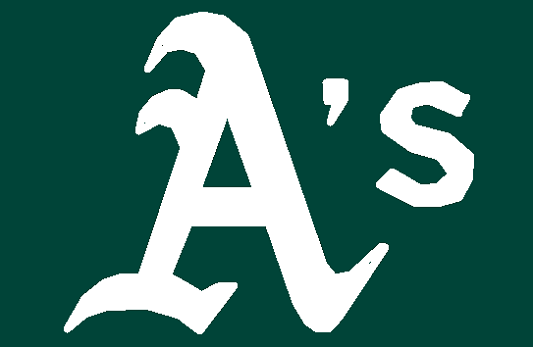
Oh, The A’s hat. Nice, simple logo. Classic “baseballish” design that uses the same monogram from when they were the Philadelphia Athletics and the same green they used in Kansas City, and a simple two color design. Granted, the lower case “s” looks like it’s been kidnapped from an entirely different font set, but I guess that’s fine since we should be focusing on the big “A” anyhow. I recently purchased an A’s hat and, though I’m not likely to wear it often (a good friend points out that while certain other teams will beat up fans from rival teams, A’s fans beat up their fellow fans – so there’s nowhere safe to wear this hat), I’m pleased with the overall design.
Coming soon – Every single hat ranked from worst to first
MLB Hats Ranked – NL East – NL Central – NL West – AL East – AL Central – AL West – MLB 30