
Since I’m trying to keep the entries on the individual hats as hat-focused as possible, I should point out here that, growing up, I was a fan of the Mets in specific but the National League in general. Of the teams in the NL Central, I was an avid fan of the Reds due to their amazing 70’s line up – George Foster, Johnny Bench, Tony Perez, Joe Morgan, Dave Concepción, pre-scandal Pete Rose, César Gerónimo and Ken Griffey, Sr. Then, of course, Marge Schott came around and spoiled my love for the team. Oh, racist owners. Is there nothing you can’t ruin?
I also had a soft spot for the Brewers (because I have soft spots for teams that never quite make it to the big show) but Bud Selig owned them and that sort of ruined them for me.
Fortunately, there’s the Cubs and… Oh damn.
Anyhow, I guess my point is that most of my emotional and nostalgic connections to NL Central have been frayed to the point of snapping. Let’s look at the hats (caps, if you prefer).
(Note: When there’s more than one logo, I’ve made the decision to focus on the monogram logos)
5. St. Louis Cardinals
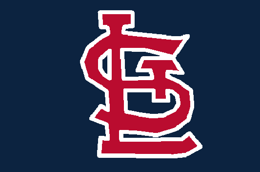
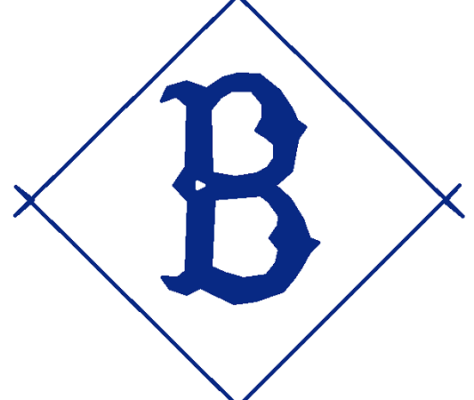
There’s two hat logos for the Cardinals. I very much like the “cardinal perched on a baseball bat” image, though I wonder what circumstances led to the bat being in good perching position. Is a player holding the bat but not swinging it? Did somebody mount a bat on a house in such a way that it sticks out just so? Did the cardinal grab the bat of an opposing team’s batter and fly off with it then install it in its nest? Is that a very tiny bat or a very enormous cardinal? That logo raises questions. The logo I’m rating here, though, is the appalling “StL” logo with the “T” that looks like a stake driven through the heart of the “S” to keep it from rising from the grave and feasting on the blood of innocents. You’ll note that, despite font changes, this arrangement of letters goes back to the team’s beginning. I applaud their dedication to maintaining this connection to their history, but argue that the monogram has always been awful – indeed, the current logo is the best of a bad lot. The Cardinals are one of the great baseball franchises and deserve great logos to match. The bat-stealing cardinal is that logo (a strong contender for #1 on another list). The vampire monogram is not.
4. Milwaukee Brewers
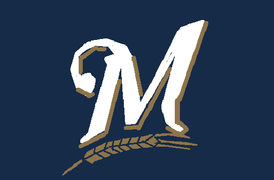
The Brewers currently have three active hats, two of which I really like. These two both use the late 70’s logo – a lower case “m” and “b” arranged in such a way to look like a baseball mitt catching a ball – with different color schemes. I prefer the version with the navy blue background to the more “traditional” one with the regular blue background. That logo is both 70’s-riffic and meets my “baseballishness” criteria (and would also be strong contenders for #1 on another list). On the other hand, their logo that I like least – and the one we’re looking at here – is the M with barley below it. While I have to give the Brewers credit for making this logo look like that of chain pub – “T.G.I. Brewers”,” perhaps – it loses points on the “baseballish” scale for me. Of course, baseball is all about beer, but the Brewers’ logo is belching the quiet part loud, as it were. Also, that single sprig (leaf? growth? stalk?) of barley reads as a fast moving feather upon first look. Ask me how I know.
3. Cincinnati Reds
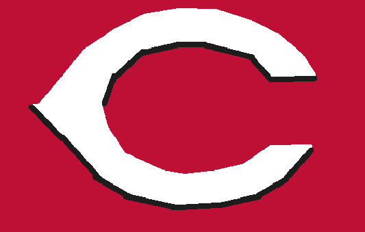
From the beginning, the Reds’ hat logos have looked like bad science fiction claws. The original logo looks like the tendrils of some angry plant creature. The current one looks like a sleeker Dr. Who villain claw. Like imagine the Doctor goes to a planet with sentient lobsters. The odds are good that, when the Doctor reaches out to shake their hands, what they’ll extend will be the Reds’ current logo. I appreciate the simple white on red color scheme and think this one is just quirky enough to be baseballish – just from the weird corner of baseball. You know, the one where giant cardinals fly around snatching bats away from unsuspecting batters.
2. Chicago Cubs
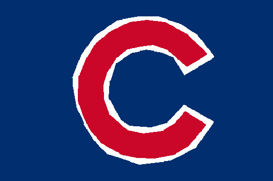
Do you need to add another lower case “c” to the Cubs’ lower case “c” to indicate that it is an image under copyright or is the Cubs’ “c” an indicator of copyright in and of itself? I ask myself this question all the time. No. Constantly.
What I love about the Cubs’ “c” is that it is lower case – because it’s not a full grown bear, just a little cub. They adopted this “c” in the mid-50’s after abandoning a very familiar claw-like c logo. The red on white on blue works fairly well for me – it uses the colors of the American flag without screaming “I AM USING THE COLORS OF THE AMERICAN FLAG.” I’d always wanted a Cubs cap, but then their World Series victory in 2016 heralded the start of the end times(c) so I’m a little more dubious now. Still, great design.
1. Pittsburgh Pirates
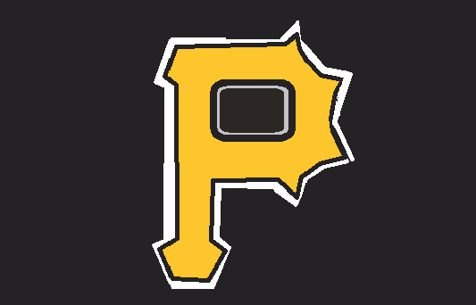
It’s hard to argue with the current gold-on-black Pirates logo – primarily because it looks like some sort of deadly spiked cudgel. Baseball is a game where you use a club to bash something that looks like a stitched together head as hard as you can. At last, here is a logo that suggests the suggested brutality of the game. It is a clean logo that doesn’t looks slick (well, the real one, not my hastily drawn MS Paint parody). It’s a natural evolution of a logo and color combination that they’ve been using since 1948. In brief, a simple, powerful logo that works on every level I use to gauge quality logo design. Man, I wish I cared about this team bcause I would wear the heck out of this hat. In fact, I’ll wear this has if I ever visit Pittsburgh (I try to get a team hat whenever I visit a MLB city). Also, if you armed me with something that looked like this “P,” I could defend myself against Dr. Who style crustaceans or giant mutant cardinals should they invade.
Coming Soon – National League West
MLB Hats Ranked – NL East – NL Central – NL West – AL East – AL Central – AL West – MLB 30
That Cubs logo used to be prevalent at The Jack! (Jackie Robinson Stadium on City Island, Daytona Beach. Now we have the Daytona Tortugas
It’s really kind of brilliant in its simplicity.