
I’m a fan of baseball and if I were to just rank all the caps on how I feel about teams it would be:
3. Yankees
2. Everyone else
1. Red Sox
But how I feel about the teams is not what this list is about. This is about hats. I will be looking at the official 2019 team hats and mostly ignoring earlier hat designs (sorry, classic Minnesota Twins hat – you’re still my fave but you’re long gone). I will try to be relentless and merciless in my objectivity but, I mean, come on. Not realistic.
I’ll be focusing on color, design and “baseballishness,” the quality of how much something invokes the classic – even sentimental – part of the baseball tradition. In the spirit of drawing this out over multiple entries, I’ll rank each division with extended commentary and then, at the end, I’ll provide a list of all 30 hats ranked with minimal commentary.
Also, following tradition, I’m crudely drawing all the hat logos using MS Paint. IF you want to see what they actually look like (and they’re all better than my parody approximations) visit the baseball section at SportsLogo.net.
Let’s get right into this with the National League East Division
5. Miami Marlins
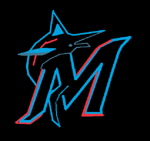
It is essential that a baseball logo pass the “can it be drawn easily by a second grader on a chalkboard” test. The Marlins’ 2019 logo is a pain in the butt to draw, particularly using MS Paint. It also suffers from the fact that it could just as easily be a logo for a public access cable fishing show, but no point deduction for that. I’d prefer the stylized marlin by itself or even just the somewhat-too-slick “M.” Color scheme is fine. The Marlins are a newer team so their logo feels like a corporate design choice – in other words, not very “baseballish.”
4. Washington Nationals
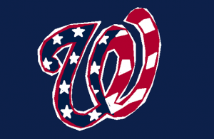
The Nationals’ logo is a stylized W with a “stars n stripes” pattern. Imagine if the U.S.A. flag was turned into a goofy cartoon snake and you’ll get the idea. The only thing that would make it more cliche would be to impose it on a field of apple pies. You could wear that driving around in your Chevrolet feeling as American as a tourist in Acapulco complaining that everyone there spoke too much Spanish. Corporate marketing style patriotism aside, it’s way too busy and it renders the W illegible. This flag pattern also causes this logo to fail the “can a second grader draw it” test. I know this because I have the drawing skills of a second grader.
3. Philadelphia Phillies
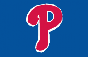
The classic – I mean century old classic but not the “stripes and no letter P” classic – Phillies cap logo was a generic “P” that could easily have stood for “Penn State” or “Pstate College.” Their current logo hearkens back to their 1934-37 cap logo so points for connecting to their team history. When I was growing up in the 70’s, their logo looked like it might be the “p” from Up With People with a baseball in the P’s negative space. If you spun that 70’s logo around you’d have the opening animation for an ABC afterschool special. It was gloriously dreadful and I still love it. I’m not convinced the current logo is better. It looks a bit like the kind of plump slug the Philadelphia Eagles’ logo would devour after pelting it with batteries. Also, the Phillies colors don’t do it for me.
2. Atlanta Braves
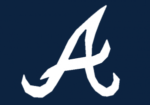
Hate the team, love the hat. Well, I love the stylized “A” hat. The tomahawk hat pisses me off. So does their team name. They’ve used the same stylized A since the team’s inception and could easily ditch the (yes) racist team symbol and team name. As long as they’re still Atlanta [something], the classic cap logo still works and it looks great. Whether they change their name to the Phoenixes or the Engines or what have you, they’re still Atlanta. I also like the fact that the logo could be a super-stylized version of Patrick the Starfish. Try to unsee that.
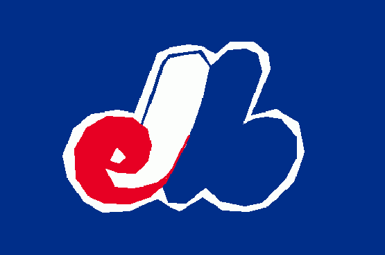
1. New York Mets
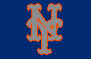
The Mets have used essentially the same cap logo since 1962. It’s a classic baseball look and if it’s derivative of the (and it hurts to write this) truly classic Yankees logo, well, there’s only so many ways to arrange an “N” and a “Y.” Blue and orange don’t make an especially attractive color pairing (quite the opposite exclaims everyone who knows a little color theory) but the orange is usually understated and looks pretty good when paired with the grey. I’d gladly wear this hat.
Coming Soon – National League Central
MLB Hats Ranked – NL East – NL Central – NL West – AL East – AL Central – AL West – MLB 30
…with a baseball in the P’s negative space/i>
I remember that Phillies Logo when I lived there 1978-1984
It’s goofy and totally 70’s, but it’s also kind of perfect.